BARTable
BART’s destination brand, graphic standards, and original discovery website.

Bay Area residents and visitors
Brand identity & graphic standards · Website design & development · Interactive mapping

Bay Area residents and visitors
Brand identity & graphic standards · Website design & development · Interactive mapping
Project overview
The challenge
BART wanted to encourage trips beyond the daily commute and help people discover how many events and destinations were reachable by train.
Our work
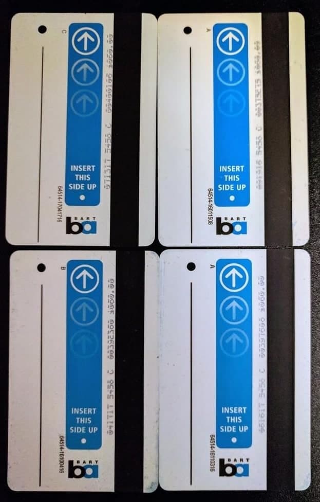
The BARTable logo was inspired by the arrows on certain versions of BART’s paper tickets. BlinkTag designed the BARTable logo and graphic standards and worked with BART on the name, identity, and website concept.
A familiar arrow, a new identity
Building the original discovery website
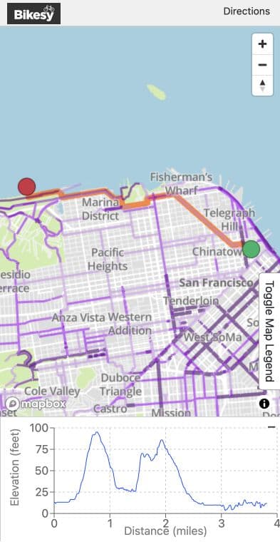
BlinkTag built the original BARTable website in Drupal and developed its graphic design and outreach strategy. Maps, station-based discovery, and trip planning helped visitors find BART-accessible events and destinations.
An identity riders see throughout the system
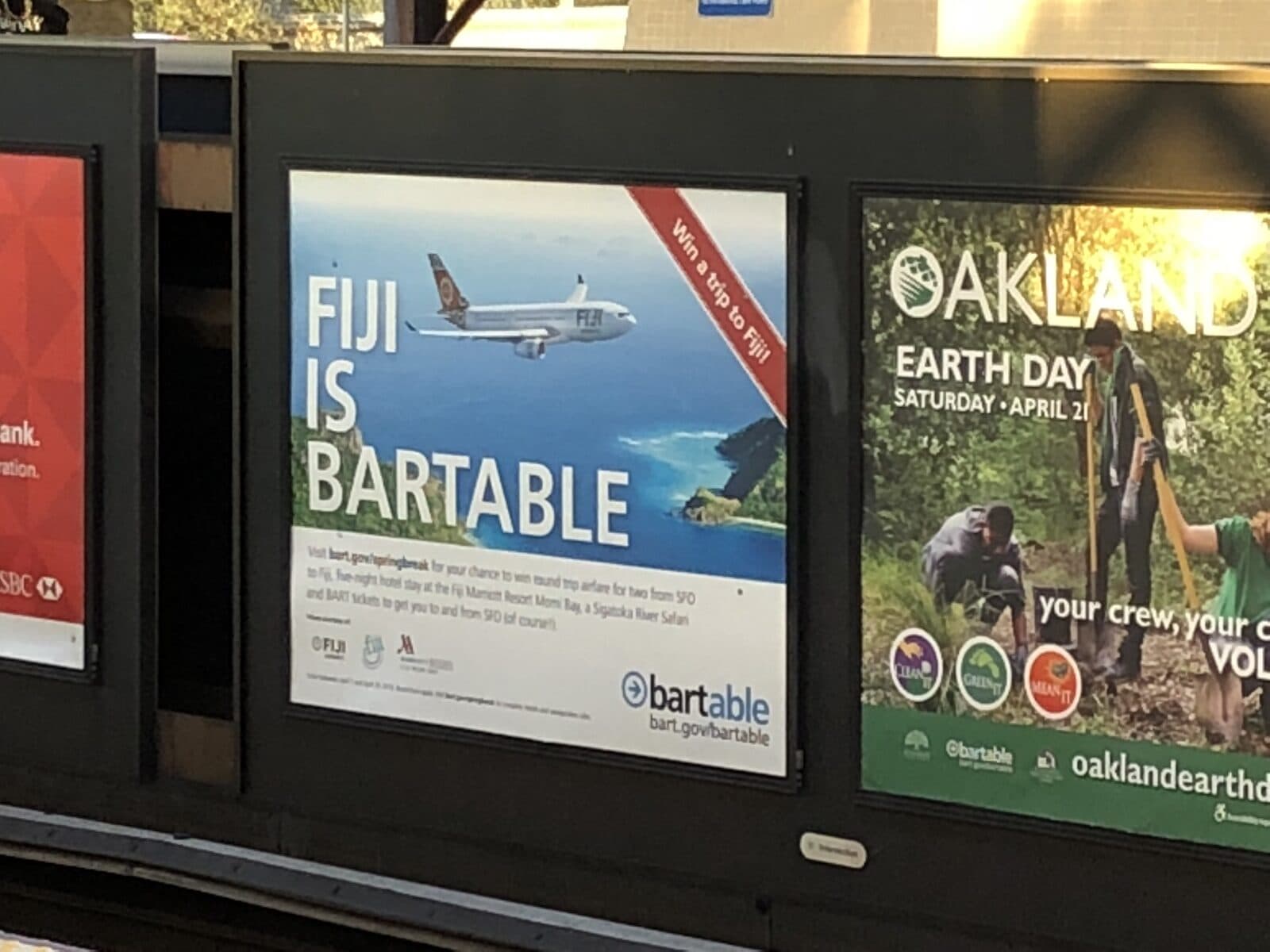
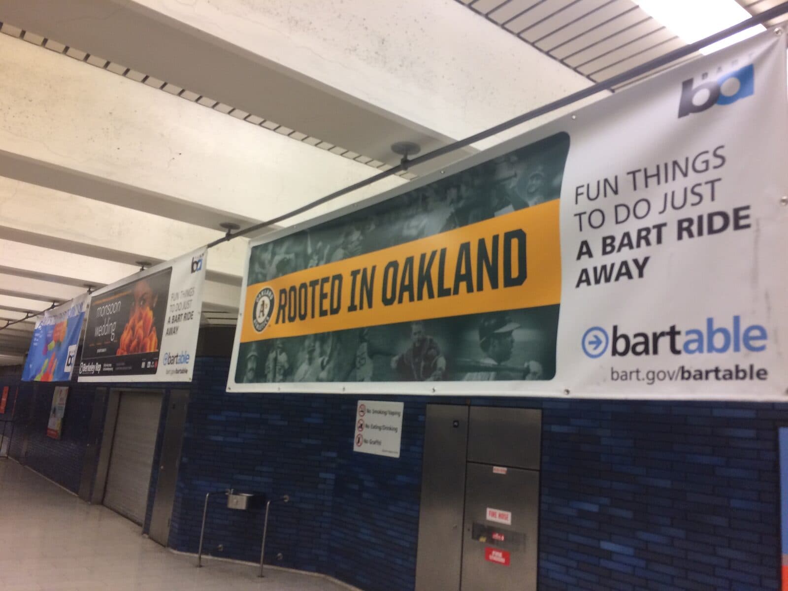
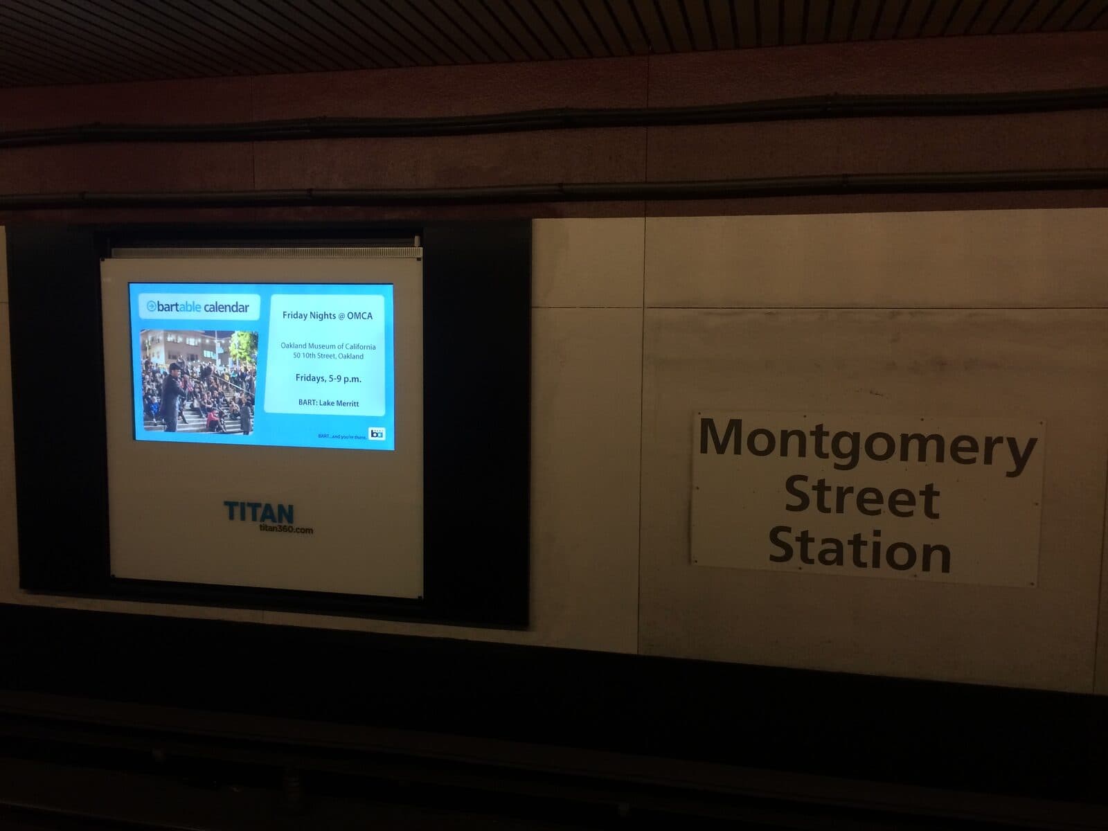
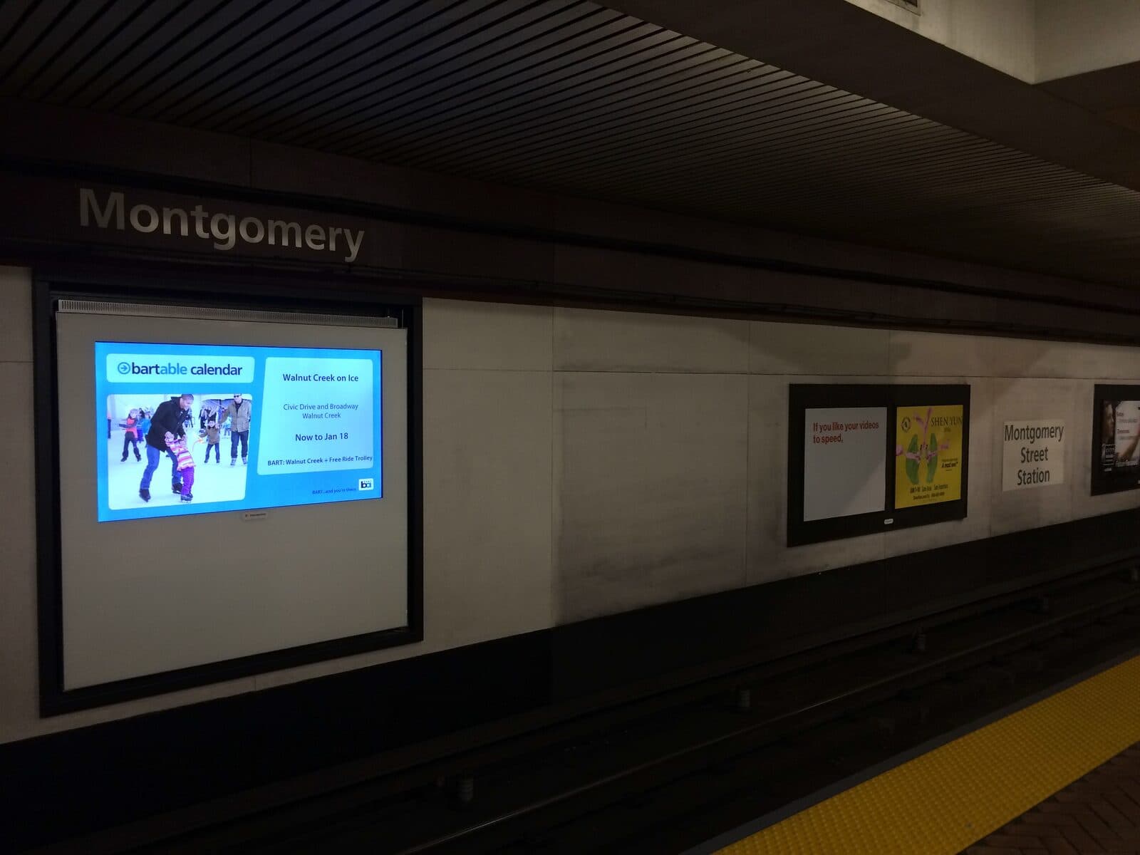
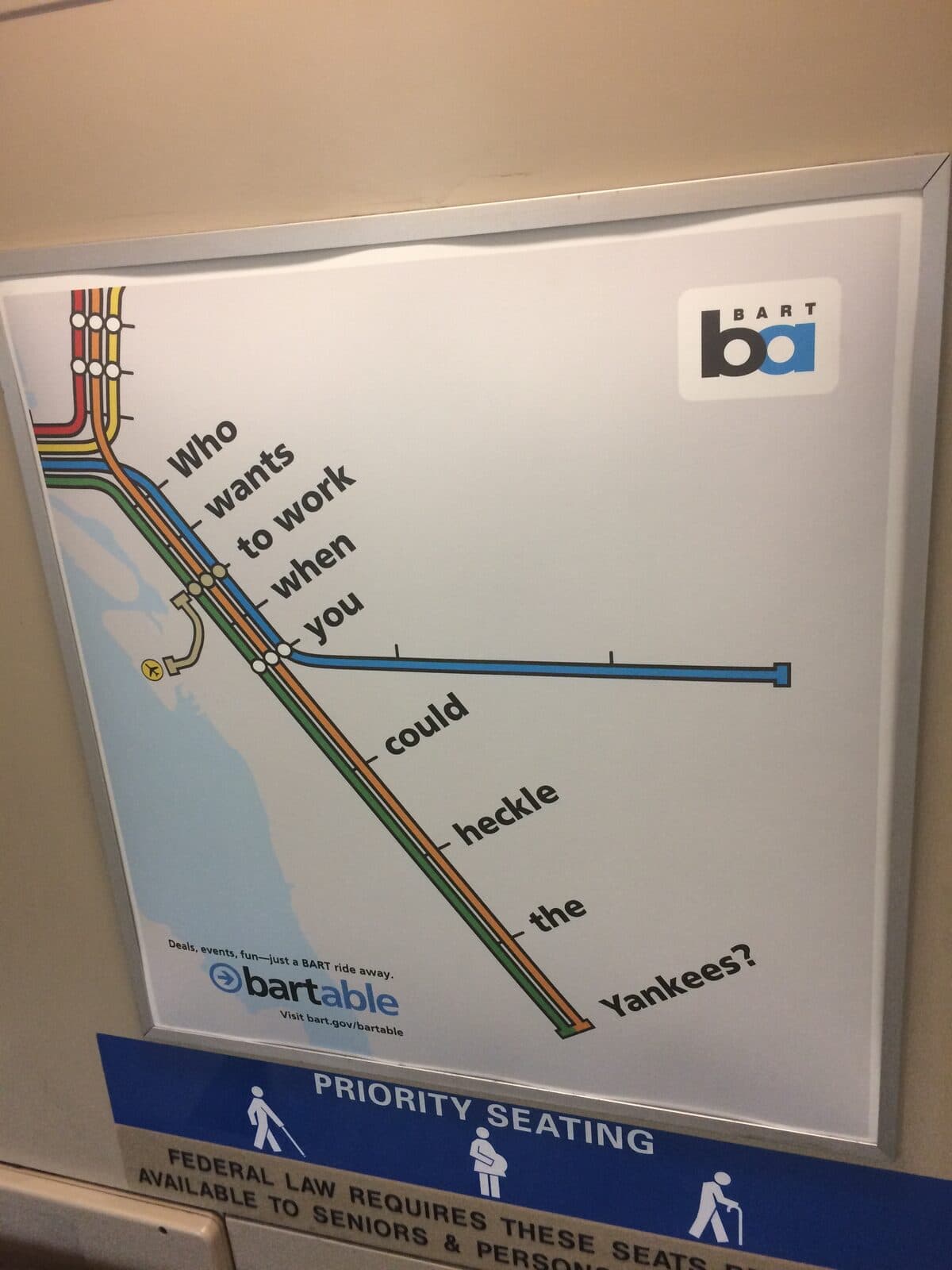
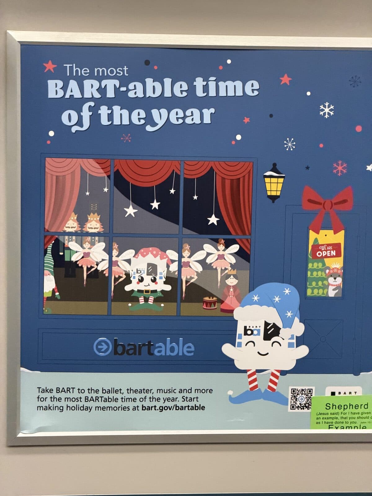
BART uses the BARTable identity on vehicles, platforms, station advertising, and television ads.
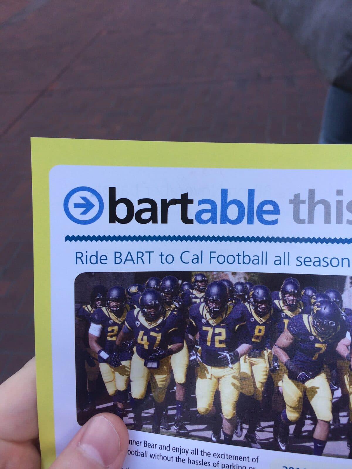
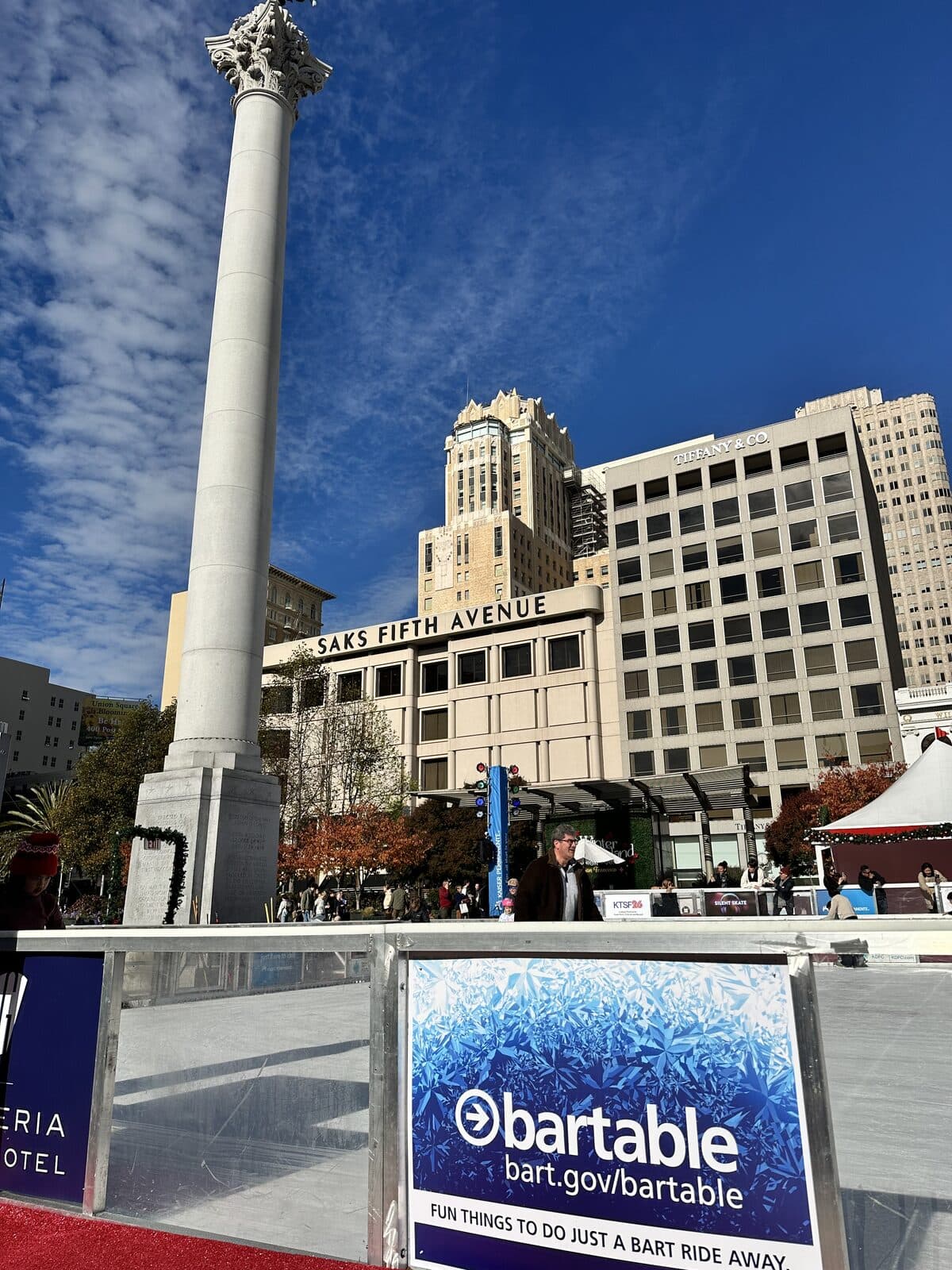
The BARTable identity in use
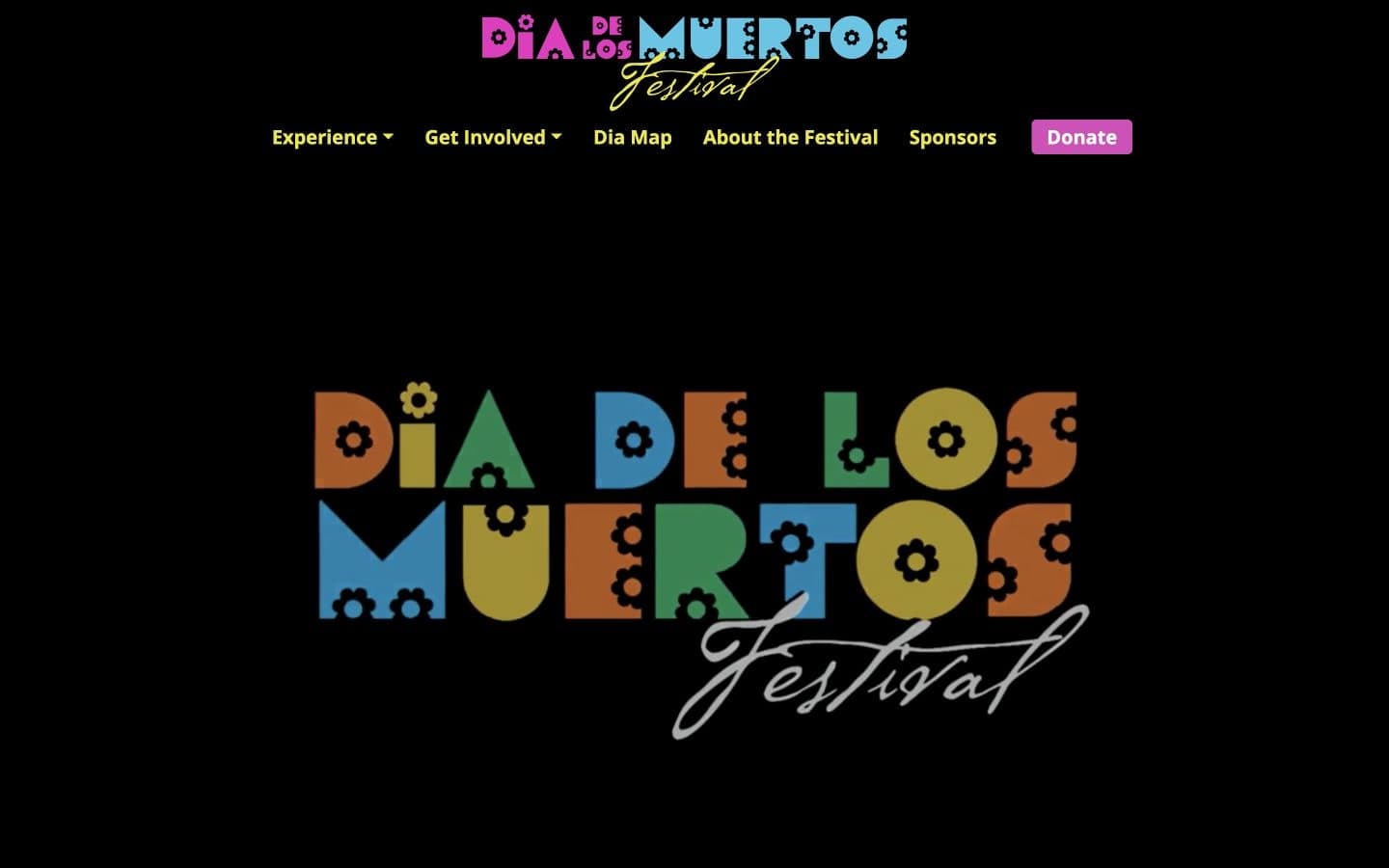
The logo BlinkTag designed appears on station banners, onboard advertisements, digital event calendars, printed promotions, and event signage.


Related projects
Planning a similar project?
Tell us about your requirements and the people who will use the system.